Maturity Model for Product-Tech Teams
A continuous improvement tool to help teams to perform
For several years I supported teams in improving their way of becoming the unreachable high performing state. It is more common than I initially thought that teams lose their sense of evolving and becoming better, sometimes because they are unable to move forward, other times because they felt that there was nothing else to be improved, and also because they were stuck on where to start.
That’s why in my endless need to create tools and methods that people can use even without me being there every time, I wanted to create something to give teams and leads what is expected from them and how they can improve.
George E.P. Box a British statistician said: “All models are wrong, but some are useful”. This tool is not meant to be the ultimate panacea of continuous improvement. This model tries to bring some light to the teams that need to improve and provide guidance on where to start and how.
Maturity Model Overview: what is this about?
This tool is what we would call a “subjective” or “opinion-based” tool. It means that we are not looking into objective data. We are asking people, with their biases and ideas, for their opinion on several topics. We used a survey where we asked around 40 questions from 10 different categories. Each question has to be rated from 1 to 6 (from strongly agree to strongly disagree).
Those categories are:
Agile Processes
Customer Centricity
Fast Validation
Just one team
Problem-focus
Purpose
Stakeholder Management
Team Culture
Team Metrics
Team Organization
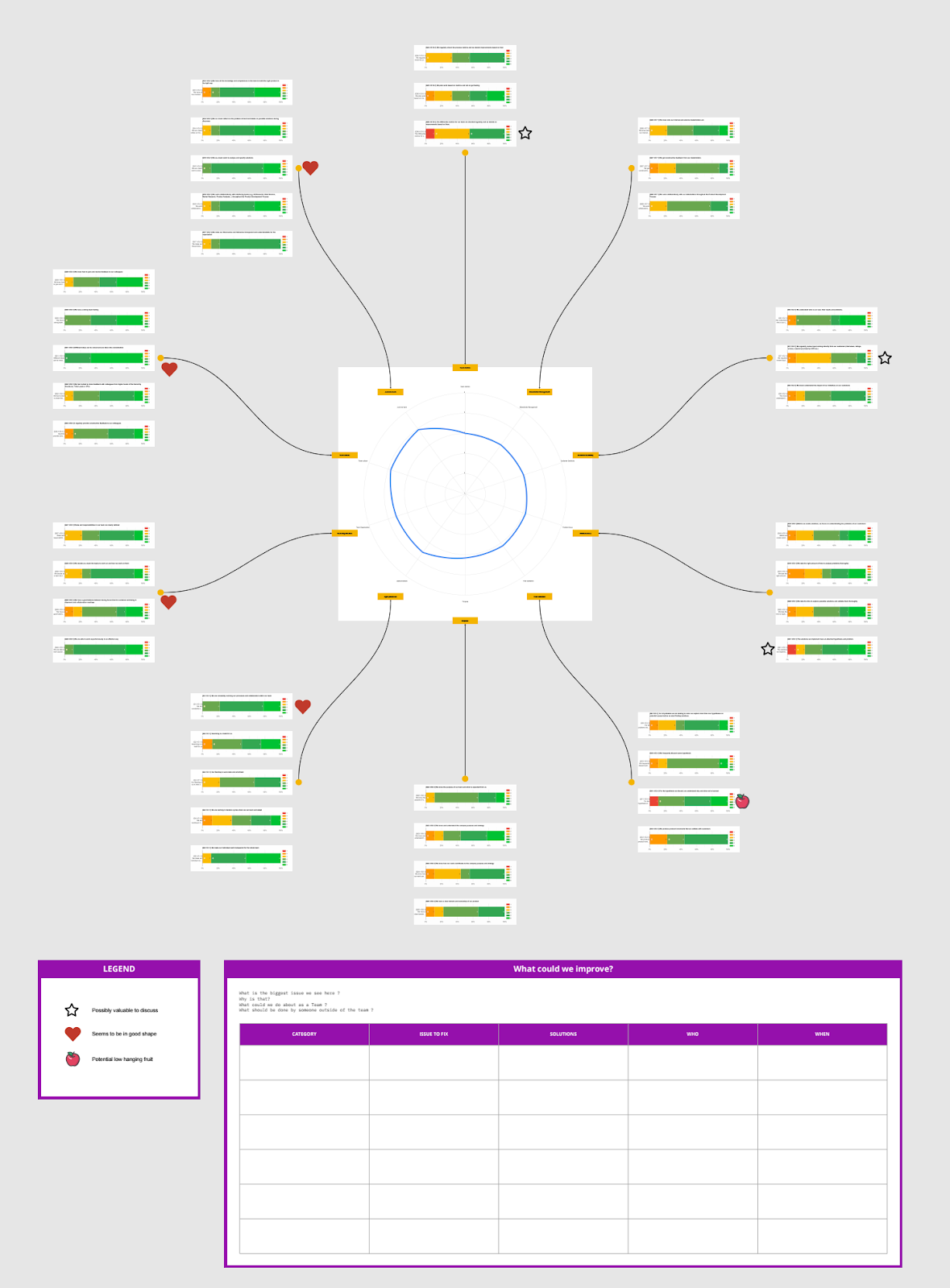
Once the team answered all the questions we were building a Miro board (a digital whiteboard tool) with an overview of all the data collected.
It is organized in the following structures:
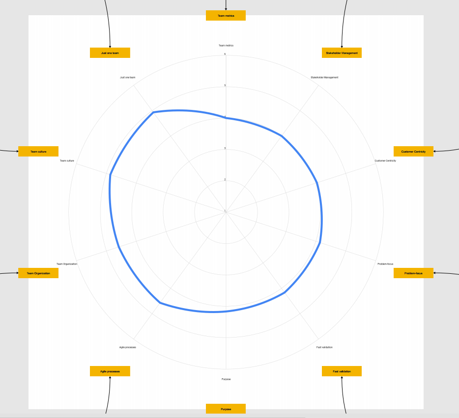
The Nautilus Shell. It is the central chart. It is an ordered radar of the categories, where we can see what are the areas where there’s a bigger opportunity to improve.
The question charts. They are organized by category.
The stickers with insights from the coach.
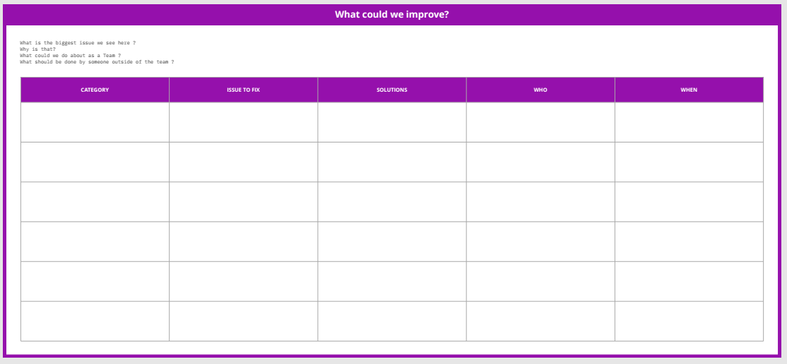
The improvement matrix. Where the team chooses the category to work on, the issue to fix, the possible solutions or experiments, and who or when
Let’s deep dive into each of the structures.
The Nautilus Shell
Each of the categories has a score that is calculated by the average score of all the questions that belong to the category. This chart acts as a team radar. A commonly used practice in visual management. A small but important detail is that the exact number of the average is not displayed. That is made on purpose because if you give the exact score, you could give the feeling of accuracy. The score is meaningless by itself. What is important is how the team interprets it and serves as a trigger for an improvement, not as an end goal.
This visualization is useful to quickly see where are lower and higher scores. Each team will have a different shape, if the “jump” in the nautilus (the distance between the higher score and the lower score) is higher it can mean that the team has a bigger distribution of scores. That could lead to the hypothesis of having an unbalanced team in those categories.
The labels with the category name are linked with the question chart areas, so when analyzing the topic people can easily deep dive and get more information about the score.
The question charts
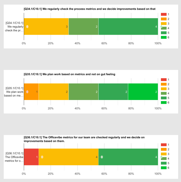
The questions are grouped by the category they belong to. The image above shows 3 questions that belong to the category “Team Metrics”.
These charts represent the distribution between the answers to each question. For example, on the question “We regularly check the process metrics and we decide improvements based on that” there were 3 people that voted 3 out of 6, 2 people that voted 4 out of 6, and 4 people that voted 5 out of 6.
As the score in each answer is represented by a color, from red (bad) to green (good) it is easy to visually check for those questions with more types of answers, or if the team thinks in the same way, or if the team is polarised. In the example image we can see in the question “We plan work based on metrics and not on gut feeling” a very spread distribution of answers, while in the question “The Officevibe metrics for our team are checked regularly and we decide improvements based on them”, it’s more a polarised distribution.
Stickers with insights from the coach
Before checking the results with the team I am taking a look and identifying how can I guide the team in their discussion. So I was marking some questions using 3 different stickers:
Possibly valuable to discuss (⭐). Questions labeled with a star are the ones where I saw inconsistencies. Especially those with polarised answers. Maybe there’s a misunderstanding or a different perception of reality. Most of the time, when the team spent just 5 minutes discussing, it already improved the topic.
Seems to be in good shape (❤️). Those questions that from my experience seem to be above the average. So compared with other teams that used the Maturity Model they seem to be quite good. It doesn’t mean that they can’t focus on improving it. But it’s more information for them to decide.
Potential low-hanging fruit (🍎). There are some topics that, knowing the context and the history of the team, they can try some small experiments to quickly improve. In case the team chooses to focus on one of those, I was offering my support in training or coaching them.
I try to keep the stickers to the minimum possible amount to not influence them too much. Also, on the board, there’s already a lot of information, and populating it with a lot of stickers will lead to more confusion and less focus.
We build it in a Miro board because we wanted the team to discuss the results and decide what they want to focus on.
The improvement matrix
This structure is similar to the common retrospective formats that a lot of teams use. In our case we wanted to document:
Category. For the improvement we want to plan, what is the category it belongs. It isn’t as simple as saying “just the lowest score categories”, then you are taking away the autonomy of the team to decide the improvement area. They should choose the category. As Frederik Laloux said in his famous book Reinventing Organisations: “The key question here is: for which change is there most energy? Where is energy currently blocked or waiting to be set free?”
Issue to Fix. or What is the problem? That could be referenced from a question or from another cause derived from the discussion they had. It is important to understand what are we trying to change or fix before we jump on ideas. Otherwise, we could be solving the wrong problem.
Solutions. The team list all the ideas and experiments they can think of to try or run on the next cycle.
Who. Defines de owner or the accountable. The person on the team who will make sure that there’s a follow-up on the topic. If the discussion ends with the session, there’s no value in the model. It should be a continuous evolutionary improvement.
When. To align expectations within the team, it is important to understand when are we going to check for the outcome that our ideas generate. It is not a deadline for the initiatives, it is a moment to follow up and decide on the next steps.
So, how do we run it?
The process I usually do it’s the following:
Talk with the team lead to understand the context and team situation. Depending on the information gathered I will advise using the Maturity Model or not. For example, if they are still building the team and they have some relational issues, I will advise them to do something directly on that line and leave the Maturity Model for the future.
Introduce the Maturity Model concept with the team and gather their thoughts. I share the entire questionnaire and an example of what they can expect in advance. Then I collect their feedback and thoughts, so I can consider them before running it.
Send the survey to the team. I give the team usually around a week to answer it, although it could depend on the information gathered from previous steps.
Collect the results and build the Miro board. In case it’s not the first time, I build it on the same board as before, in a different section. In that way, they can compare also their evolution.
Analyze the results and add the stickers (❤️⭐🍎) as described before.
Get together with the team and run the workshop.
Before ending the workshop collect the ROTI (Return of time invested) and decide on the next iteration.
This model is meant to be repeated over time, we consider that the best timeframe is from 3 to 6 months. It doesn’t mean that you don’t improve the team in the meanwhile, but this tool is more meaningful in that timeframe.
How do we build it?
To finalize this article, let me give you 5 cents on how we came up with the questions and the method.
We interviewed several people within the organization, including leads from different levels, team members, stakeholders, etc. The question we asked them was: “What do you expect from a Product and Tech team?”. As you may imagine the answers were very different and vague sometimes, but we found common topics between all the conversations. Also, we as Agile Coaches have some expectations about the teams so we added them also. The result was the categories we listed previously. When we decided on the categories we slowly worked on the questions, returning to the interviews sometimes and changing the category label even.
Something that was very important for us is that we do NOT ask questions like “Are you working in Scrum?” or “Do you have a retrospective every 2 weeks?”. It is more important what is behind those tools and practices, like “We regularly check our process metrics and we decide on improvements based on them”. So that works independently if the team is working in Scrum, Kanban, or another framework or process.
It is more important what is behind those tools and practices
When we had the first version of the Maturity Model, we introduced it to a couple of teams, letting them know that the tool was new and asking for feedback continuously. It was a pretty great success as we were requested by more teams to roll it out faster. In this first iteration, we changed some questions that were ambiguous and removed a question that was perceived as a duplicate.
On a second iteration, we went on a very interesting journey. Automating it. Collecting the answers, building the charts, and building the miro board took a considerable amount of time, so we decided to invest in a script that was automating a big part of it. The script was taking the answers from the survey, building the individual charts on Google Spreadsheets, and connecting to Miro to build the board automatically. If you are interested in the script you can find it on my GitHub. (If you are a developer and clicked on the link let me apologize for the code.)
On the third iteration, we worked with our colleague Bettina Körner who is a Business Psychologist to sharpen the questions even more and we changed the scoring from 1-5 to 1-6. In that way, we eliminated the middle answer that was “not good, not bad” so people need to decide if it’s a bit more positive than negative.
As a final gift, if you want to check all the questions we ask, here you have a Spreadsheet with them. Enjoy.


